A professional-looking and functioning web design is always important, but when it comes to eCommerce websites – it’s an absolute must. The quality of the website will create a perception of trust. When a site is poorly built, users lack faith in the validity of the site and don’t trust it enough to input their credit card information. The result?
If a customer still chooses to do business with your brand, if they lack confidence in your website, they will either visit your store to make a purchase or call in their order. The entire purpose of your eCommerce is to save your business money on cost and labor by creating a more efficient process. Along with a professional site that runs smoothly, companies also need to be innovative and make their website fun and appealing.
I spent an afternoon researching small to mid-size businesses’ (SMBs) eCommerce website and choose some examples of sites that are implementing these tactics to make customer feel good completing their purchases online and they are growing as a result.
1. Tens
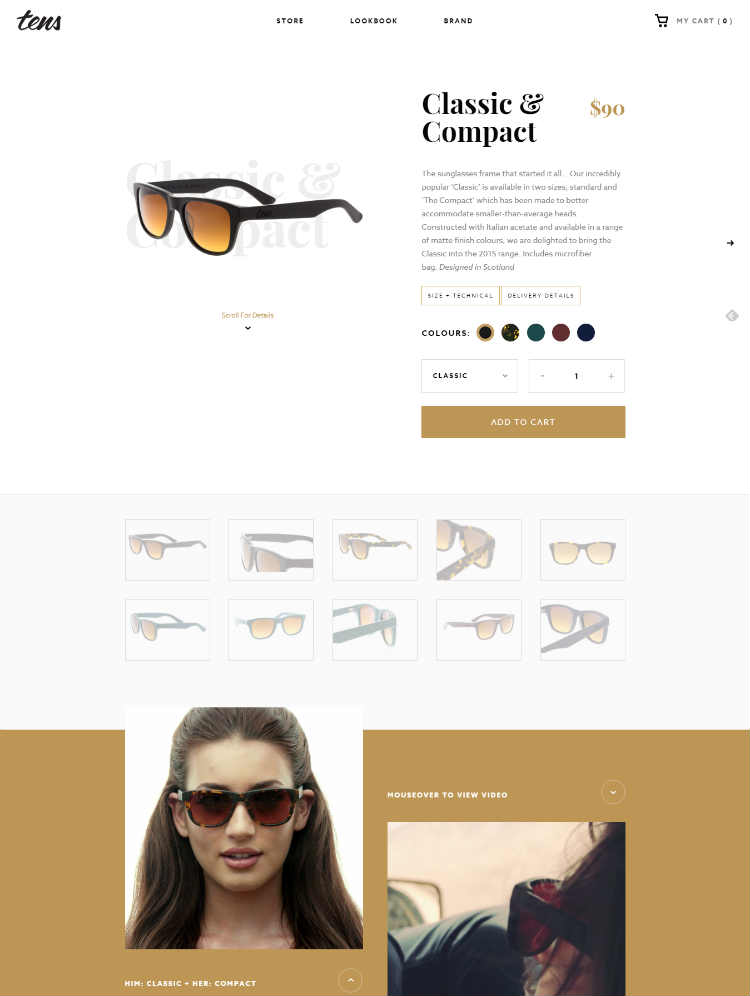
Why we love it: It’s the wow factor. Amazing video. High-resolution images. The Tens eCommerce website has a downright stunning design – a must for a successful eCommerce website. A cluttered or messy store is not inviting and doesn’t attract customers and the same principal is applied to an online store.
Takeaway: Video marketing is taking over and becoming practically mandatory for successful digital marketing – the Tens website incorporates high-quality, interesting videos and graphics with motion that are consistent with their brand messaging.
While the homepage of an eCommerce website is obviously one of the most important pages, arguably product descriptions might be even more vital. It’s on our product description pages that you have your big chance to make your sale and you literally have 10 seconds to convince the user that they want your product.
I am completely sold on these sunglasses on Tens. The description is short and clearly states the most important features of the glasses within the first sentence. The featured image is large and many views are available and there is even a video of someone wearing them!
2. CustomInk
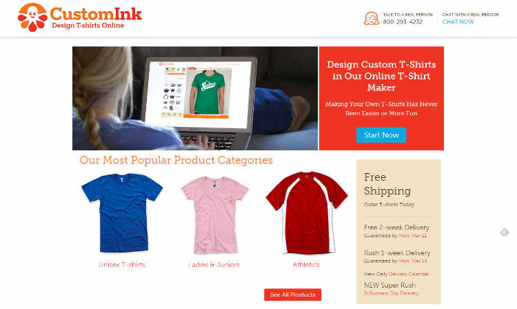
Why we love it: An eCommerce store that allows you to create your very own T-shirt needs a clean design and format that is easy to operate and extremely user-friendly. Convulate the process with cumbersome directions or over-complicated navigation and customers will bounce right on to the next website.

Creating your own T-shirt on CustomInk is fun and easy because of the clearly labeled buttons and simple navigation.
Takeaway: I decided to create a single T-shirt to test the website’s usability. I was immediately impressed with the “design lab” interface where you customize your T-shirt.
First of all, the shirt is on a photo of a real person and you can rotate in any direction to see all angles of the shirt, making it easy to get a realistic expectation of how it will look in real life. All the buttons were clear, easy-to-understand and anyone can operate this system – even those that are less tech-savvy. Pre-loaded options for text, colors, and graphics were abundant and the process was fun!
3. Ferguson
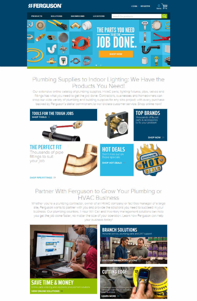
Why we love it: I’ve really got to hand it to whoever designed the Furgeson website for making something that would normally be rather boring (shopping for plumbing supplies) an exciting experience. The Furgeson site does a nice job of organizing their different product categories in a Pinterest-style board layout that allows users to quickly see their immense range of products at a glance. They also break up the images with clever copy, benefits, and services on the homepage.
Takeaway: One of the most important components of an eCommerce website is the checkout experience. Ferguson nails it with a shopping cart that loads quickly and provides seamless transition from the rest of the website. This builds trust with the user and promotes the confidence needed for them to complete their purchase online.
4. Cienne
Why we love it: An eCommerce website that is created to sell clothing and women’s fashion needs to have an equally fashionable website to complement their products. The Cienne website does it and makes it look easy. The homepage has a simplistic design with a one-image full background that delivers a big impact while showcasing some of their clothing.
Takeaway: What impressed me the most on their website was the product listings pages. It can be tricky to strike the right balance between providing enough details to make customers click through, while keeping the page from getting too busy. They have a good strategy by offering some of their top-selling products on the page, while not listing so much inventory that it becomes too overwhelming and ends up paralyzing the user.
What we love about it: The AMS website pairs its nice looking bikes with a masculine design to deliver an overall impressive and cool website. The loading time on page is really fast which is extremely important for any website, but especially with eCommerce. When you hover over items on the homepage, popups deliver more information to help get customers to click-through. Instructions even pop up on screen creating a dynamic effect that illustrates how all the components work together – a very innovative and useful feature.
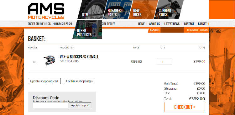
Takeaway: The shopping basket on the AMS website offers a smooth transition from browsing to purchasing. In the world of eCommerce, the whole goal is to get the customer to the payment portal with as few obstacles as possible, and this site allows you to complete your entire purchase in just a couple of clicks. The checkout process is also mobile responsive, which is really important considering that currently 50.3 percent of all eCommerce traffic is mobile.
eCommerce is a lot more than just making products available online. There are a lot of factors that go into actually making the sale and a lot of them have to do with:
- The quality of the site
- Whether or not it’s trustworthy
- It is appealling and easy to use
- It is compelling enough to make users complete purchases online, or would they rather call or go to the store
If you are spending money advertising your store, but are not seeing a lot of results and low conversion rates, it probably has something to do with quality of your online store rather than the ads, we help companies actually make sales online and not just list products. Reach out to us today for a free quote.






Leave A Comment